Customising the colour scheme
The appearance of the application layout control, both in terms of colours and placement, is all done through CSS. I would recommend sticking with the overall layout then tweaking it. Start small - just change some colours to match your corporate palette, and maybe tweak the column widths or fonts as required.
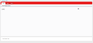
Firstly, create a style sheet in Notes then attach that style sheet to your custom control which contains the application layout control as a resource. After that it is just a matter of using Firefox with Firebug or Chrome to identify the styles which apply to the elements you want to change, and creating over-riding definitions in your style-sheet. Within a short time I changed the default colour scheme to a grey and red one which now looks like this:

Adding elements to the layout properties
There are a lot of things you can add to your page through the layout properties. To set them, open your custom control, expand the outline and select the Application Layout object. In the properties panel select All Properties then expand Other and Configuration.

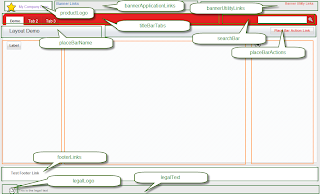
There is quite a large range of things you can set in this properties list. In the image below, the various sections that are controlled through the properties are outlined in green and labelled with the appropriate property name (click on the image for a larger view). The orange rectangles define the page content areas.

Logo, Title, Legal Logo and Legal text
For the logo, add an image resource to your database, then add the name of this image resource to the productLogo property. The placeBarName property is a good place to add your application title. This can be hard-coded or you could compute the value and use @DbTitle(); as the formula, so that your database title is displayed here. In the image above, you can see my database title (Layout Demo) in the grey place-bar . The legalLogo and legalText are simple properties which can be set in a similar manner as the productLogo and placeBarTitle
Links and Tabs
The various link and tabs properties are set differently to the text and image properties. These are configurable lists. To add entries, click in the right-column next to the property name, then click the + button.

You will need to select the type of 'node' you are adding to your list. There are nine different types of nodes and I haven't used them all yet, but below is a brief description of them. Each one has it's own set of properties, and these are different for each type of node.
- xe:basicContainerNode -- Allow you to create sub-lists. I think this could be useful for a side-menu, but I haven't tried it with any of the layout lists shown above.
- xe:basicLeafNode -- Use this to link to any standard URL. You can hard-code or compute the href and label properties. This can be used for links to standard Domino forms or pages, or any other general type of link. For links to another xPage, use the pageTreeNode instead
- xe:beanTreeNode -- Sorry - haven't investigated this one yet !
- xe:dominoViewEntriesTreeNode -- you can retrieve entries from a view, based on a key or key array, similar to getEntriesByKey method in lotusScript. You could use this if you had your menu items stored in documents within your database
- xe:dominoViewListTreeNode -- retrieve a list of views or folders.
- xe:loginTreeNode -- haven't used this one yet either (check out the example database that you downloaded with the extension library - it show the usage of all these list types)
- xe:pageTreeNode -- use this if you want to point to another xPage. All you need to enter is the page name in its simplest form (e.g. demo.xsp) and the text you want displayed. There is no need to compute the entire URL - that's all done for you
- xe:separatorTreeNode -- inserts a separator - vertical or horizontal bar as appropriate
- xe:userTreeNode -- I haven't tested this one either, but it appears to be a way to insert additional text or images which are not active links
The properties for each type of node vary. I found the pageTreeNode and basicLeafNode the most appropriate for the layout control. Check out the properties of each one to get a better idea of how they operate.
Search Bar
The search bar is automatically rendered if your database is full-text indexed. You need to enter the name of the page to open when the user clicks the search icon into the search bar properties. The search text will be appended to the page url as a query string parameter.
Hiding and displaying sections
The layout contains 5 main components or sections in addition to the content area, laid out vertically. Each section can contain one or more sub-components. By default each section is rendered if it contains something but is hidden if empty. You can over-ride this behaviour by setting the appropriate layout property. The properties for the five sections from top to bottom are banner, titleBar, placeBar, footer and legal. Each one takes a value of true or false, or can be computed.
For sub-components of the main sections you can set the rendered property to control when an item is displayed. This is the xPages equivalent of a Hide-when formula. For example, you could hide some of the tabs or links based on the current user's role, computed at run-time
Design for re-use
For a simple application, you should be able to configure the application layout control so that it can be used across most of your application. Set up the look and feel and the general navigation in just one place, then apply it to each page of your application. Individual pages can then have their own content in each of the three central panels. In my next post I'll look at creating a menu in the left panel using the Page Navigator control.