Friday, July 22, 2011

Domino Designer: Open tabs side by side

Maybe I'm just really slow, but after using DDE for over two years, I only just discovered that you can place design elements (or design views for that matter) side-by side. Very useful on a wide-screen monitor.

Just drag any open tab to the right-margin of DDE.


And here you go - the windows side-by side.


Monday, March 21, 2011

xPages Extension Library for beginners - Part 3: Customising the Application Layout Control

Firstly, sorry for the delay in getting my next post published - things have been very busy at work and with the family.

Customising the colour scheme


The appearance of the application layout control, both in terms of colours and placement, is all done through CSS. I would recommend sticking with the overall layout then tweaking it. Start small - just change some colours to match your corporate palette, and maybe tweak the column widths or fonts as required.

Firstly, create a style sheet in Notes then attach that style sheet to your custom control which contains the application layout control as a resource. After that it is just a matter of using Firefox with Firebug or Chrome to identify the styles which apply to the elements you want to change, and creating over-riding definitions in your style-sheet. Within a short time I changed the default colour scheme to a grey and red one which now looks like this:


Adding elements to the layout properties


There are a lot of things you can add to your page through the layout properties. To set them, open your custom control, expand the outline and select the Application Layout object. In the properties panel select All Properties then expand Other and Configuration.


There is quite a large range of things you can set in this properties list. In the image below, the various sections that are controlled through the properties are outlined in green and labelled with the appropriate property name (click on the image for a larger view). The orange rectangles define the page content areas.


Logo, Title, Legal Logo and Legal text


For the logo, add an image resource to your database, then add the name of this image resource to the productLogo property. The placeBarName property is a good place to add your application title. This can be hard-coded or you could compute the value and use @DbTitle(); as the formula, so that your database title is displayed here. In the image above, you can see my database title (Layout Demo) in the grey place-bar . The legalLogo and legalText are simple properties which can be set in a similar manner as the productLogo and placeBarTitle

Links and Tabs


The various link and tabs properties are set differently to the text and image properties. These are configurable lists. To add entries, click in the right-column next to the property name, then click the + button.


You will need to select the type of 'node' you are adding to your list. There are nine different types of nodes and I haven't used them all yet, but below is a brief description of them. Each one has it's own set of properties, and these are different for each type of node.

  • xe:basicContainerNode -- Allow you to create sub-lists. I think this could be useful for a side-menu, but I haven't tried it with any of the layout lists shown above.

  • xe:basicLeafNode -- Use this to link to any standard URL. You can hard-code or compute the href and label properties. This can be used for links to standard Domino forms or pages, or any other general type of link. For links to another xPage, use the pageTreeNode instead

  • xe:beanTreeNode -- Sorry - haven't investigated this one yet !

  • xe:dominoViewEntriesTreeNode -- you can retrieve entries from a view, based on a key or key array, similar to getEntriesByKey method in lotusScript. You could use this if you had your menu items stored in documents within your database

  • xe:dominoViewListTreeNode -- retrieve a list of views or folders.

  • xe:loginTreeNode -- haven't used this one yet either (check out the example database that you downloaded with the extension library - it show the usage of all these list types)

  • xe:pageTreeNode -- use this if you want to point to another xPage. All you need to enter is the page name in its simplest form (e.g. demo.xsp) and the text you want displayed. There is no need to compute the entire URL - that's all done for you

  • xe:separatorTreeNode -- inserts a separator - vertical or horizontal bar as appropriate

  • xe:userTreeNode -- I haven't tested this one either, but it appears to be a way to insert additional text or images which are not active links

The properties for each type of node vary. I found the pageTreeNode and basicLeafNode the most appropriate for the layout control. Check out the properties of each one to get a better idea of how they operate.

Search Bar


The search bar is automatically rendered if your database is full-text indexed. You need to enter the name of the page to open when the user clicks the search icon into the search bar properties. The search text will be appended to the page url as a query string parameter.

Hiding and displaying sections


The layout contains 5 main components or sections in addition to the content area, laid out vertically. Each section can contain one or more sub-components. By default each section is rendered if it contains something but is hidden if empty. You can over-ride this behaviour by setting the appropriate layout property. The properties for the five sections from top to bottom are banner, titleBar, placeBar, footer and legal. Each one takes a value of true or false, or can be computed.

For sub-components of the main sections you can set the rendered property to control when an item is displayed. This is the xPages equivalent of a Hide-when formula. For example, you could hide some of the tabs or links based on the current user's role, computed at run-time

Design for re-use


For a simple application, you should be able to configure the application layout control so that it can be used across most of your application. Set up the look and feel and the general navigation in just one place, then apply it to each page of your application. Individual pages can then have their own content in each of the three central panels. In my next post I'll look at creating a menu in the left panel using the Page Navigator control.

Saturday, February 12, 2011

xPages Extension Library for beginners - Part 2: Using the Application Layout Control

Starting with the Application Layout control


The Application Layout control in the xPages Extension Library is a powerful control to allow you to set up web pages which follow the IBM OneUI theme. This allows for consistent presentation across web applications and it looks pretty good. Not a bad thing if you are not a Web Designer but rather a back-end developer tasked with creating a reasonable looking web site. You can see it in action in the various Wikis published by IBM such as the Lotus Notes and Domino Application Development wiki

There is a video on the OpenNTF project page which describes how to use the control.

You will need to watch that video - overall it is excellent and I don't intend to repeat what it says here. However the video appears to assume that you know a little bit about how extension controls are implemented and what you need to use them. I found myself pausing, rewind, pausing & replaying that video so many times that I decided to document the additional information I thought was missing.

Go on - go and watch it ......

OK - so did you get to about 1 minute in, where the presenter pasted some code into designer then moved on quickly and go "Woah - what was that? Was it important? Does my code need to be identical? Where do I get that code? What does it do? Stop, stop, go back " That was my reaction.

The code is important - it is key to getting the control working. We will get to the code later. First I'll go through the basic setup of the control. Follow the video instructions on adding the extension library to your application and setting the oneUI theme. Then drag the Application Layout control onto a blank custom control page in designer.

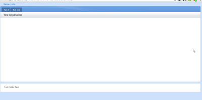
Next, set some basic properties on the control as shown in the video. Set the control configuration to xe:applicationConfiguration as shown, then set some dummy tabs, placebar text, logo, footer etc. Finally, create a blank xPage, add your custom control and preview it in a browser.


So far, so good. Next you want to add some content. This is where the code is important.

Warning: everything from here on is what I have discovered by trial and error. If you see any glaring errors, please comment so that others don't follow down the wrong path.

Editable Controls, Facets and callbacks


The key to how this and other similar extension library controls work is the editable area control. If you add an editable area onto a custom control then add your custom control to an xPage, you can drag your page content onto the editable area and have it displayed inside the other parts of the custom control. This allows you to reuse a custom control on many pages and add page-specific elements into the control on each page.

Behind the editable areas are facets and callbacks. When you add an editable area to a custom control, designer automatically adds the following code to the source view

      <xp:callback facetName="facet_1" id="callback1"></xp:callback><xp:br></xp:br>  

A callback is therefore the definition of a target area - it says 'put the page specific stuff here'. When you use the custom control and drop your content (for example a panel) onto it in an xPage, you designer adds the following code like this inside the tags of your custom control:

 <xp:this.facets>  
<xp:panel xp:key="facet_1">My test xPage custom stuff goes here</xp:panel>
</xp:this.facets>

The facets element could be translated as 'here is stuff I want to put into the custom control'. The panel has an ID which tells it where to place the content - facet_1 was the facetName property of the callback element shown above.

Finishing of your custom control


So back to our application layout control. Firstly, you need to enter a Design Definition for the control. This is the first piece of code pasted into the control properties in the demo video. Rather than trying to enter your own code, I suggest you grab a copy of the code in the demo database that was downloaded with the extension library. Open the OneUILayout custom control, select the Custom Control in the Outline pane then select the Design Definition tab in the properties pane.


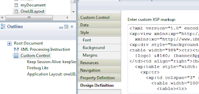
Now paste the code into the same place in your own custom control.

Lets have a quick look at what you get

 <?xml version="1.0" encoding="UTF-8"?>  
<xp:view xmlns:xp="http://www.ibm.com/xsp/core"
xmlns:xc="http://www.ibm.com/xsp/custom">
<xp:div style="background-color:#CEE1FC; padding:5px">
<table width="98%"><tr><td>
{logo} &#160; {bannerApplicationLinks}
</td><td align="right">{bannerUtilityLinks}</td></tr></table>
<xp:table style="width: 98%; background-color:#FFFFFF">
<xp:tr>
<xp:td colspan="3" style="background-color:#4586D3">
<table width="100%"><tr><td>
<table><tr>
<td style="background-color:#4372A9;color:#FFFFFF">
{titleBarTabs}</td>
<td style="background-color:#E4E8EF">
selected</td>
</tr></table>
</td><td>
<div style="float:right;background:#FFFFFF">
{searchBar}</div>
</td></tr></table>
</xp:td>
</xp:tr>
<xp:tr>
<xp:td colspan="3" style="background-color:#E4E8EF">
<table width="100%"><tr><td><h2>{placeBarName}</h2></td>
<td>
<div style="float:right;border:thin solid #C0C7CD">
{placeBarActions}</div></td>
</tr></table>
</xp:td>
</xp:tr>
<xp:tr>
<xp:td style="width:123px" valign="top">
<xp:callback id="LeftColumn" facetName="LeftColumn"/>
</xp:td>
<xp:td valign="top">
<xp:callback id="callback1"/>
<xp:br/><xp:br/><xp:br/>
</xp:td>
<xp:td style="width:123px" valign="top">
<xp:callback id="RightColumn" facetName="RightColumn" />
</xp:td>
</xp:tr>
</xp:table>
<xp:table style="width: 98%; background-color:#FFFFFF; margin-top:5px">
<xp:tr><xp:td> {footerLinks}</xp:td></xp:tr>
</xp:table>
{legalText}
</xp:div>
</xp:view>

What you have here is a bit of markup which creates a table-based layout similar to the appearance of oneui layout, and three callbacks. The markup controls the appearance of the control inside designer. It doesn't have any impact on the final presentation. (The oneui layout is achieved through css not tables). This means you can actually add notes to yourself such as 'profile photo should go here'. Then when your use the control in designer you see your extra markup and don't need to remove it before finishing the page. The callbacks provide the places for you to drag & drop your content. Without these you can still add your content into the appropriate place in the source code pane for your page but it won't show in the design pane.

Next, you need to define the facets - the targets for your data. While the visual location of these is defined by the style sheet, you need to set up the linkages that will let the control know where in the final markup to place your content. To get the facet code, switch to the source pane of the OneUILayout custom control. These are the key bits of code you need;

 <xe:this.facets>  
<xp:callback xp:key="LeftColumn" facetName="LeftColumn"
id="callback1"></xp:callback>
<xp:callback xp:key="RightColumn" facetName="RightColumn"
id="callback2"></xp:callback>
</xe:this.facets>

and

 <xp:callback id="OneUIMainAreaCallback"></xp:callback>  

In between is any configuration setting - you can ignore them. Copy the code and paste it into the same place within your own custom control.

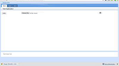
Save your custom control and return to the xPage that placed your custom control onto. You can now drag content onto the three editable areas. Note that you can only put one item in the left and right controls but you can put multiple things inside the main content area. I suggest you start by putting a panel control in here then all your other content inside the panel.

Here is an example of a completed page with some very basic content - a label on the left, an upload control in the middle and an image on the right.


Next post: how to customise the layout

xPages Extension Library for beginners - Part 1: Getting started with my first real-world xPages app

I have not posted much on this blog lately due to a number of reasons, but one of them is that I haven't been doing a lot of development lately. I've been doing admin, support, project management, just not a lot of development and very little of it with new things.


Background


I have a need to add a simple web front-end to one of our Notes apps - it's a basic document storage app but we now need to provide a portion of the content to a business partner, and have decided the easiest way to do this is via a web front-end.

I dedided to try out the new xPages extension library available from OpenNTF. as I wanted to create something that showed off the new capabilities of Notes & Domino. However I found that it was quite hard to get started with the extension library and decided to share my experience to hopefully help some others get there a little quicker.

I have not used xPages much yet. I have done a basic one-day xPages course lead by Stephan Wissel and worked my way through Declan Lynch's Learning xPages series, but have not tried to use xPages in a 'real world' scenario.


The Application


The web application needs to present documents which use a single form to the users, with some basic meta-data fields at the top and a Rich Text field. In Notes, the data is in a single view with 4 levels of categorisation. I wanted to present this using a variation of the OneUI theme modified to our company colors, and using some styling from a recently deployed Intranet (not built on Domino) that has impressed the business. So I need to build a view or document list, with searching, and a page to display the document content. I want to retain the categorisation, but not necessarily in a categorized view. I want to use the top-level category as a menu on the left, then either use a categorised view with the next levels or use drop-down selections to filter the view. As at the time of writing this I have not yet decided which way to go and will share my trials and errors along the way.


The xPages Extension Library


The xPages Extension Library is available through OpenNTF and provides a number of additional xPages controls to extend core controls and allow you to quickly build consistent web apps that implement the IBM OneUI interface.

Once you download the extension library, follow the instructions in the included pdf to install the controls both on Designer and on your server. I found these instructions clear and easy to follow so I won't repeat them here. You can then open the example database to see how various controls can be used. So far so good. However once I decided to start building some pages, I scratched my head in confusion. As an xPages beginner, the process was far more complicated than I thought and took some trial and error to get going with them. And documentation is scarce.

I decided that I want to use the Application Layout control and the Domino View control at least, so I'll explain how to get them working in the posts to follow. If I get time, I'll also try to post the resulting application at the end.

Up until now, I had sort of thought of xPages and Custom Contols as analogous to forms and sub-forms. This is only sort-of true. When you start to use the Extension Library you can see the areas how the xPages model is much more powerful. The custom controls can not only sit within the parent xpage but contain and control content that is within the page. This is how the Application Layout control works. You configure it to provide the 'look & feel' of your pages then add it to your xPage. You then specify where within the layout your page content goes.

Next post: How to use the Application Layout Control in detail.