Starting with the Application Layout control
The Application Layout control in the xPages Extension Library is a powerful control to allow you to set up web pages which follow the IBM OneUI theme. This allows for consistent presentation across web applications and it looks pretty good. Not a bad thing if you are not a Web Designer but rather a back-end developer tasked with creating a reasonable looking web site. You can see it in action in the various Wikis published by IBM such as the Lotus Notes and Domino Application Development wiki
There is a video on the OpenNTF project page which describes how to use the control.
You will need to watch that video - overall it is excellent and I don't intend to repeat what it says here. However the video appears to assume that you know a little bit about how extension controls are implemented and what you need to use them. I found myself pausing, rewind, pausing & replaying that video so many times that I decided to document the additional information I thought was missing.
Go on - go and watch it ......
OK - so did you get to about 1 minute in, where the presenter pasted some code into designer then moved on quickly and go "Woah - what was that? Was it important? Does my code need to be identical? Where do I get that code? What does it do? Stop, stop, go back " That was my reaction.
The code is important - it is key to getting the control working. We will get to the code later. First I'll go through the basic setup of the control. Follow the video instructions on adding the extension library to your application and setting the oneUI theme. Then drag the Application Layout control onto a blank custom control page in designer.
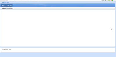
Next, set some basic properties on the control as shown in the video. Set the control configuration to xe:applicationConfiguration as shown, then set some dummy tabs, placebar text, logo, footer etc. Finally, create a blank xPage, add your custom control and preview it in a browser.

So far, so good. Next you want to add some content. This is where the code is important.
Warning: everything from here on is what I have discovered by trial and error. If you see any glaring errors, please comment so that others don't follow down the wrong path.
Editable Controls, Facets and callbacks
The key to how this and other similar extension library controls work is the editable area control. If you add an editable area onto a custom control then add your custom control to an xPage, you can drag your page content onto the editable area and have it displayed inside the other parts of the custom control. This allows you to reuse a custom control on many pages and add page-specific elements into the control on each page.
Behind the editable areas are facets and callbacks. When you add an editable area to a custom control, designer automatically adds the following code to the source view
<xp:callback facetName="facet_1" id="callback1"></xp:callback><xp:br></xp:br>
A callback is therefore the definition of a target area - it says 'put the page specific stuff here'. When you use the custom control and drop your content (for example a panel) onto it in an xPage, you designer adds the following code like this inside the tags of your custom control:
 <xp:this.facets>
      <xp:panel xp:key="facet_1">My test xPage custom stuff goes here</xp:panel>
 </xp:this.facets>
The facets element could be translated as 'here is stuff I want to put into the custom control'. The panel has an ID which tells it where to place the content - facet_1 was the facetName property of the callback element shown above.
Finishing of your custom control
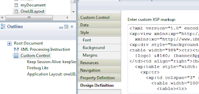
So back to our application layout control. Firstly, you need to enter a Design Definition for the control. This is the first piece of code pasted into the control properties in the demo video. Rather than trying to enter your own code, I suggest you grab a copy of the code in the demo database that was downloaded with the extension library. Open the OneUILayout custom control, select the Custom Control in the Outline pane then select the Design Definition tab in the properties pane.

Now paste the code into the same place in your own custom control.
Lets have a quick look at what you get
<?xml version="1.0" encoding="UTF-8"?>
<xp:view xmlns:xp="http://www.ibm.com/xsp/core"
xmlns:xc="http://www.ibm.com/xsp/custom">
<xp:div style="background-color:#CEE1FC; padding:5px">
<table width="98%"><tr><td>
{logo}   {bannerApplicationLinks}
</td><td align="right">{bannerUtilityLinks}</td></tr></table>
<xp:table style="width: 98%; background-color:#FFFFFF">
<xp:tr>
<xp:td colspan="3" style="background-color:#4586D3">
<table width="100%"><tr><td>
<table><tr>
<td style="background-color:#4372A9;color:#FFFFFF">
{titleBarTabs}</td>
<td style="background-color:#E4E8EF">
selected</td>
</tr></table>
</td><td>
<div style="float:right;background:#FFFFFF">
{searchBar}</div>
</td></tr></table>
</xp:td>
</xp:tr>
<xp:tr>
<xp:td colspan="3" style="background-color:#E4E8EF">
<table width="100%"><tr><td><h2>{placeBarName}</h2></td>
<td>
<div style="float:right;border:thin solid #C0C7CD">
{placeBarActions}</div></td>
</tr></table>
</xp:td>
</xp:tr>
<xp:tr>
<xp:td style="width:123px" valign="top">
<xp:callback id="LeftColumn" facetName="LeftColumn"/>
</xp:td>
<xp:td valign="top">
<xp:callback id="callback1"/>
<xp:br/><xp:br/><xp:br/>
</xp:td>
<xp:td style="width:123px" valign="top">
<xp:callback id="RightColumn" facetName="RightColumn" />
</xp:td>
</xp:tr>
</xp:table>
<xp:table style="width: 98%; background-color:#FFFFFF; margin-top:5px">
<xp:tr><xp:td> {footerLinks}</xp:td></xp:tr>
</xp:table>
{legalText}
</xp:div>
</xp:view>
What you have here is a bit of markup which creates a table-based layout similar to the appearance of oneui layout, and three callbacks. The markup controls the appearance of the control inside designer. It doesn't have any impact on the final presentation. (The oneui layout is achieved through css not tables). This means you can actually add notes to yourself such as 'profile photo should go here'. Then when your use the control in designer you see your extra markup and don't need to remove it before finishing the page. The callbacks provide the places for you to drag & drop your content. Without these you can still add your content into the appropriate place in the source code pane for your page but it won't show in the design pane.
Next, you need to define the facets - the targets for your data. While the visual location of these is defined by the style sheet, you need to set up the linkages that will let the control know where in the final markup to place your content. To get the facet code, switch to the source pane of the OneUILayout custom control. These are the key bits of code you need;
 <xe:this.facets>
      <xp:callback xp:key="LeftColumn" facetName="LeftColumn"
           id="callback1"></xp:callback>
      <xp:callback xp:key="RightColumn" facetName="RightColumn"
           id="callback2"></xp:callback>
 </xe:this.facets>
and
<xp:callback id="OneUIMainAreaCallback"></xp:callback>
In between is any configuration setting - you can ignore them. Copy the code and paste it into the same place within your own custom control.
Save your custom control and return to the xPage that placed your custom control onto. You can now drag content onto the three editable areas. Note that you can only put one item in the left and right controls but you can put multiple things inside the main content area. I suggest you start by putting a panel control in here then all your other content inside the panel.
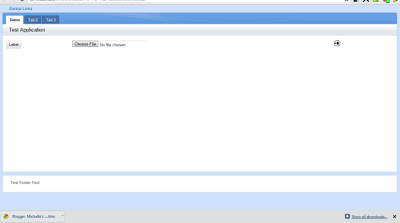
Here is an example of a completed page with some very basic content - a label on the left, an upload control in the middle and an image on the right.

Next post: how to customise the layout